
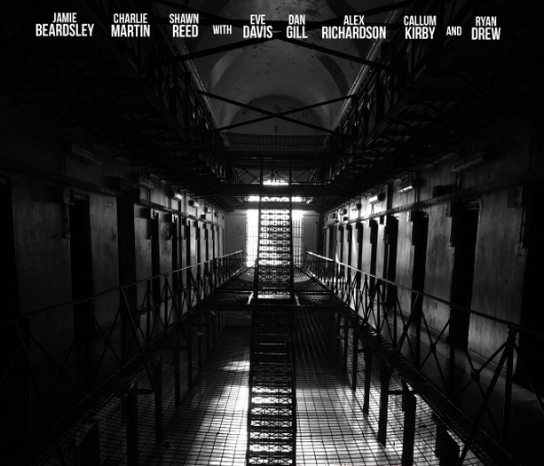
HOW EFFECTIVE IS THE COMBINATION OF YOUR MAIN PRODUCT AND ANCILLARY TEXTS?
During the creation of our media product, branding would need to be a consistent theme across our products, for us to do this, we researched various horror brands and franchises that are already established, and are easily recognised by the general public. We discovered that, the more distinctive and recognisable the brand you're trying to advertise, and how well key images can be easily recognised and lifted from within your trailer, the better. Branding can distinguish you in a crowded market, and add value to your films individual identity. With a stronger brand, a more effective and better known iconic image can result in a higher engagement amongst the audience, thus, the clearer the branding, the more viewers your movie will achieve. In regards to the Horror genre, branding plays a big part in the sales of the movie, and it can consist of various styles of image branding. This can include props made famous by the film (Friday the 13th Machete), the persona of the killer (Jason Vorhees' hockey mask), setting (Camp Crystal Lake), logo and font can be a significant part of your icon.
Brand Identities within our Products
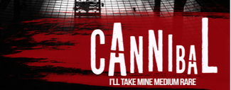
The Cannibal Logo
|
|
|
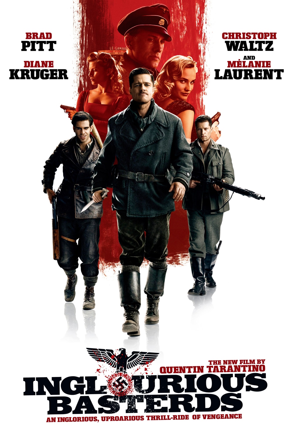
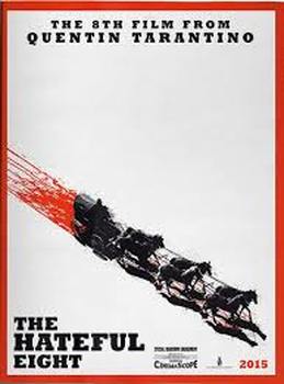
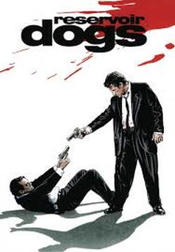
The logo we've created for our published mediums was created by overlaying our font on to a blood streak. This inspiration was gained from researching films by Quentin Tarantino. Posters for films like Inglourious Basterds, The Hateful Eight, Reservoir Dogs and Kill Bill, all of which feature some kind of blood splatter or streak. This can be seen in the examples below. This branding is eye catching, and helps to engage the audience, which is why we have elected to use it.
|
|
|
|
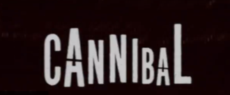
Black and White
|
|
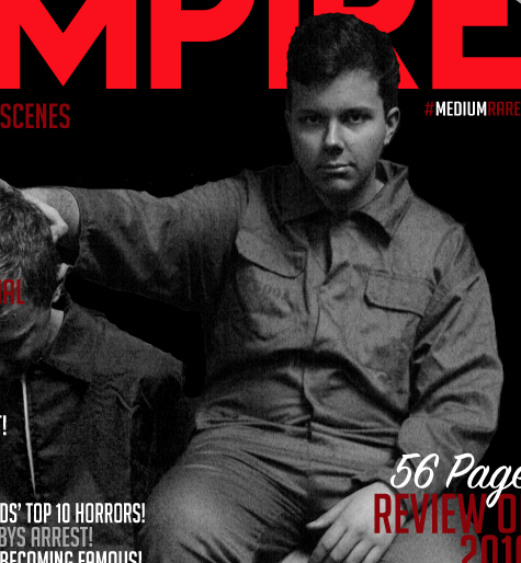
We adopted the black and white branding style to pay homage to the black and white horror classics, such as Hitchcock's Psycho, Murnau's Nosferatu and Lynch's Eraserhead. This also allowed us to have the red writing of the magazine cover and the films logo to stand out, making it easily identifiable at a glance. The positioning of the actors is also supposed to hark back to pop culture, reflecting the cover of the 2014 game Far Cry 4. This is also supposed to help the customer identify the brand, as it is something that has previously been advertised and is already embedded in popular culture.
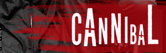
Red, Grey and White Colour Scheme
|

|

|
Our red, grey and white colour scheme is also a key identifier across our multimedia package. This branding synergy allows all three products to be easily identifiable, and therefor, effective at combing the ancillary and main products to form a brand.
Real Examples:
Iconic Font
|
|
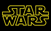
In these examples, the iconic font displayed is easily recognisable in associating the brand. The font for Star Wars means that the franchise is easily recognisable, even if the wording doesn't say "Star Wars". It is important to have this as even people who aren't english speakers can recognise the logo without know what it says. The wording of it also tells the audience exactly what the film is about. We decided to include this with our title as it keeps it simple for the audience.
Secondly, the 007 font and logo is made easily recognisable as a James Bond film, even without using that name. It is easily recognised by people who havent even seen the franchise. It is also simple and easy to read. While our font was more complex, its still easy to read.
Secondly, the 007 font and logo is made easily recognisable as a James Bond film, even without using that name. It is easily recognised by people who havent even seen the franchise. It is also simple and easy to read. While our font was more complex, its still easy to read.
Iconic Images
|
|
|
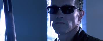
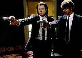
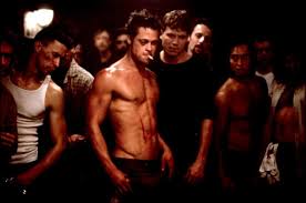
Above are some iconic images from well know films. Even audiences who hadn't seen the above films could hazard a guess at what franchise they are. The first is from The Terminator, and the iconic image from the film is the terminator sunglasses and shotgun, which are associated with the film. Secondly is a still from Pulp Fiction, and the stance they have is the iconic image for the film, its has been recreated and parodied many times, showing its effectiveness and popularity. The final is from Fight Club, and the actor is the iconic image that defines the film.
Across our media package, we have tried to borrow from all of these elements of an iconic image. Firstly, we have used the glasses that the killer wears as the iconic prop from the film, along with his green jumpsuit, which was designed to stand out from the rest. Secondly, we have tried to use the position on the cover of the killer to tie in to the brand. Finally, the actor used to play the killer appears in both the trailer and magazine, and is the only one who's face is visible on the magazine cover.
Across our media package, we have tried to borrow from all of these elements of an iconic image. Firstly, we have used the glasses that the killer wears as the iconic prop from the film, along with his green jumpsuit, which was designed to stand out from the rest. Secondly, we have tried to use the position on the cover of the killer to tie in to the brand. Finally, the actor used to play the killer appears in both the trailer and magazine, and is the only one who's face is visible on the magazine cover.
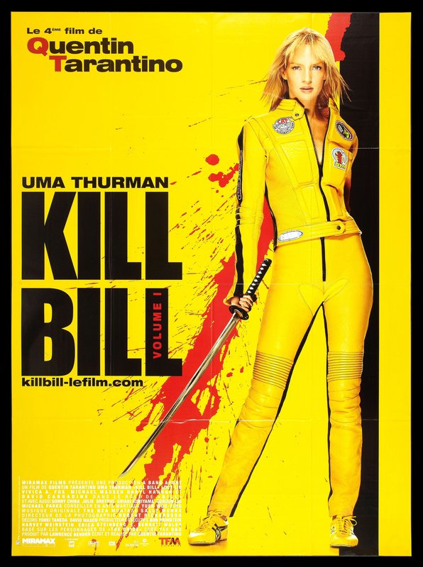
Successful Brand Analysis
|
|
|
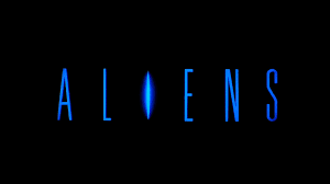
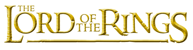
We looked at these incredible succesful film franchises to draw inspiration from. Firstly, Alien and Friday the 13th franchises both use their killer to retain popularity. The Lord of the Ring's most successful image was the Ring from it. They used the prop to tie together the branding. We have tried to use both aspects of this to brand our multimedia package.
Conclusion
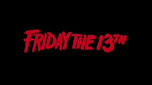
To conclude, we have successfully created a brand image that works across all of our pieces. Firstly is our Title, which features on all of our products. This could work as brand recognise, such as with the case Star Wars and Harry Potter. The second brand identity is our use of a black, white and red colour scheme, such as with the case with Friday the 13th, who's red logo is a major part of the identity. Finally, we have tried use the killer as a brand image, such as with A Nightmare on Elm Street and Alien.
