
IN WHAT WAY DOES YOUR MEDIA PRODUCT USE, DEVELOP OR CHALLENGE FORMS AND CONVENTIONS OF REAL MEDIA PRODUCTS?
Film Trailer
In our trailer, we have developed, challenged and conformed to many forms and conventions of real media products. For example in our trailer, the antagonist is the expected unpleasant looking criminal with a creepy smile. He is only revealed halfway through the trailer after first introducing the protagonist to the viewer. This is a common format for trailers to use as it is easy to follow and doesn't require a lot of attention or knowledge to distinguish between the two types of characters. We used this
We also conformed to the way that we included a lot of the films characters, both major and minor which is used in many trailers to give the viewer an expectation of the characters' traits and personalities as well as the actors that will star in the film. However, in our trailer we put our spin on this to develop the convention; we did this by giving the minor characters the same amount or more screen time as the major characters (except for the main antagonist and protagonist). This is to create suspense and confusion as to where the story of the film will take the viewer instead of spoiling the experience of watching it by including all key moments of the film in the trailer, allowing smart viewers to be able to work out the storyline from the trailer. We felt that this will make our trailer more successful at creating hype for the film because it creates mystery and makes the viewer wonder where the story is going.
We also conformed to the way that we included a lot of the films characters, both major and minor which is used in many trailers to give the viewer an expectation of the characters' traits and personalities as well as the actors that will star in the film. However, in our trailer we put our spin on this to develop the convention; we did this by giving the minor characters the same amount or more screen time as the major characters (except for the main antagonist and protagonist). This is to create suspense and confusion as to where the story of the film will take the viewer instead of spoiling the experience of watching it by including all key moments of the film in the trailer, allowing smart viewers to be able to work out the storyline from the trailer. We felt that this will make our trailer more successful at creating hype for the film because it creates mystery and makes the viewer wonder where the story is going.
This is one of the trailers for the 2016 film "Don't Breathe". We thought that it revealed too much of the plot as after watching the trailer, we found it easy to see where the story was heading while watching the film. In fact, this was only one of many film trailers that we saw that had this problem. This is not what we wanted from our trailer so we decided to challenge this convention in order to make ours stand out.
Magazine Cover
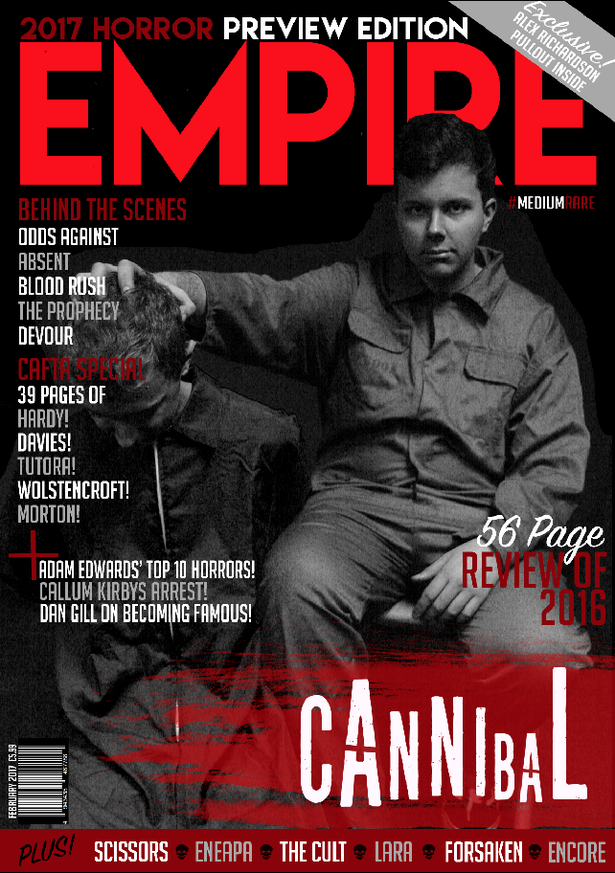
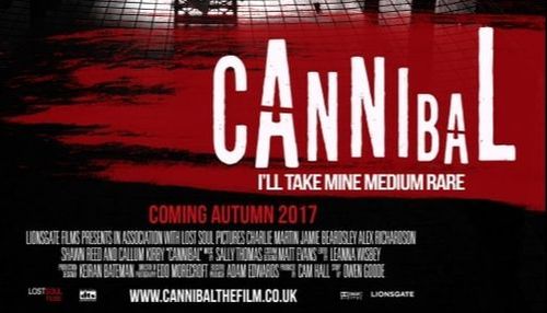
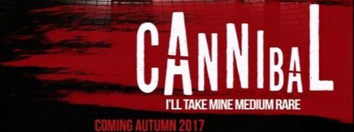
This is the magazine cover that we made for our film 'Cannibal'.
Colour Scheme
Our magazine cover has a colour scheme of black, white and red. This conforms to the convention as black and white is usually used to represent depression and lifelessness and red is used to represent blood. This fits our film trailer because the main antagonist is a psychopath that has no morals. The theme of the film is also about cannibalism and darkness so the colours fit perfectly. This conforms to the convention that red is used on magazine covers for slashers to represent blood and black is used to represent darkness.
Layout
The layout of our magazine cover is typical when compared to other film magazine covers. We conformed to the convention because otherwise it could cause confusion when people see it on shelves. For example, if the title was in small writing at the bottom of the page, people might not realise that it’s a magazine and decide not to look at it. The carefully designed layout of our poster makes it aesthetically pleasing to the eye.
Direct Address
The main character in our trailer is seen staring into the camera for the magazine cover. We did this because it gives the viewer an interesting juxtaposition between evil dominance and intimacy; this is likely to attract them to read the article about the film. This is to maximise the success of the magazine as, if people are intrigued to read about the film, the magazine cover succeeded in its job- to make as much profit possible by selling as many copies possible and encourage as many people to read the article as possible. This also benefits the film as lots of the readers will want to watch the film if they haven’t already. This is a common feature for magazine covers advertising films and it’s usually successful so we decided to conform to this convention.
Barcode
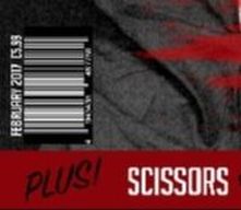
The barcode on our cover is located at the bottom left corner and it is quite small. This means that it does not take attention away from the important things on the cover that viewers should be focused on. It also has the date and price on it so it is easy to find out if the magazine cover is in date and how much it costs. This conforms to the convention that the barcode is usually small and located somewhere that it is not going to be an eyesore for the overall design. It also conforms to the convention that the price is on the barcode so it is easy to find out how much it costs.
Hashtag
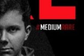
This is on our magazine cover because it gives the readers the opportunity to do their own research online about the film and talk about it with other people. If they searched '#MediumRare' on Twitter they would likely find people who just read the article too and are expressing their thoughts on it which is known as ‘enunciative productivity’ according to John Fiske. This is good for the film as the people will most likely say good things about it if they are interested in searching for more information which will be promoting our film to other people online.
This is on our magazine cover because it gives the readers the opportunity to do their own research online about the film and talk about it with other people. If they searched '#MediumRare' on Twitter they would likely find people who just read the article too and are expressing their thoughts on it which is known as ‘enunciative productivity’ according to John Fiske. This is good for the film as the people will most likely say good things about it if they are interested in searching for more information which will be promoting our film to other people online.
Title
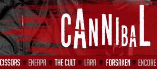
The title of our film is located at the bottom of the cover underneath the actors and is quite large; this distinguishes it from the title of the magazine so that people that see the magazine for the first time can easily identify the film’s title. It is the same iconic logo that we used on our poster, featuring the unique white writing on the red blood trail. This continuity is used so that customers that read the article will be able to quickly identify the poster as advertising the same film.
Poster

This is the poster we made for our film 'Cannibal'.
Colour Scheme
Similarly to our magazine cover, our poster has a colour scheme of black , white and red. The black represents darkness and mystery, the white represents the hope and innocence of the killers victims and the red represents their blood. This matches the theme of our trailer as it is about cannibalism and having these colours on our poster will help the viewer recognise that. This is because the colour scheme is popular with slasher films like ours so we conformed to this convention to our benefit because people that like slashers will probably want to see our film after viewing the poster.
Image
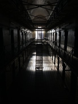
This is the picture that we used for the background of our poster. The photo was taken before we filmed our trailer in this location and it depicts the view of the prison cells from the second floor of the three-story prison. This gives the viewer a sense of looking in which is exactly what we wanted as this will intrigue them to find out more about the film. This is because they may feel like they have connected with the characters that are held within the prison cells. It is also a good photo because it appears that each and every prison cell contains a prisoner; if the viewer has seen our trailer, they will learn that this is not the case as riots soon break out and chaos ensues. This challenges convention because most film posters for slashers depict their killer for the viewer to see. However, our poster just gives you a view of the setting and the title 'Cannibal'. This leaves the viewer with thoughts in their head of what the cannibal may look like or if there are more than one, enticing them to want to watch the trailer.
|
|
|
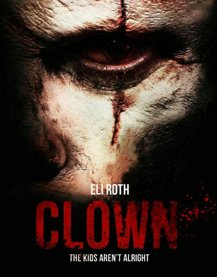
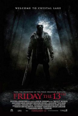
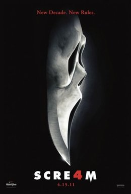
These are example of posters for recent horror films and they all depict the killer as the iconic image.
Title
Our iconic title with the unique text positioning is once again located at the bottom of our poster, as it was with our magazine cover. This continuity enables our film to be easily recognisable as the blood streak with white writing at the bottom of the poster will remind the viewer of the magazine cover that they might have seen advertising the same film. To have our title at the bottom of the poster, we have conformed to the convention of most film posters as viewed above. We did this because it helped us to create focus on the setting of the film which we think is the most intriguing factor of our poster.
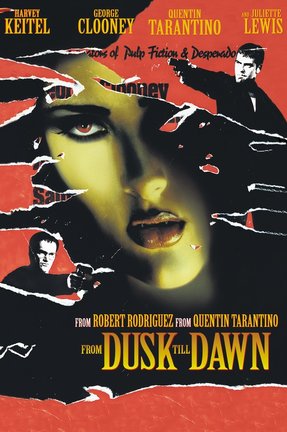
The blood streak design was also inspired by works of another filmmaker. Lots of Quentin Tarantino's films' covers and posters feature blood as a design, whether it's in streaks or just splats. We thought this was very clever and would benefit us so took our own take on it and implemented the idea to create our title. This is because the film is called 'Cannibal' and having a blood streak behind the word helps to emphasise this to the viewer which will create images in their head about what may be featured in the film.
The blood streak design was also inspired by works of another filmmaker. Lots of Quentin Tarantino's films' covers and posters feature blood as a design, whether it's in streaks or just splats. We thought this was very clever and would benefit us so took our own take on it and implemented the idea to create our title. This is because the film is called 'Cannibal' and having a blood streak behind the word helps to emphasise this to the viewer which will create images in their head about what may be featured in the film.
Layout
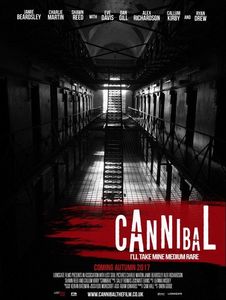
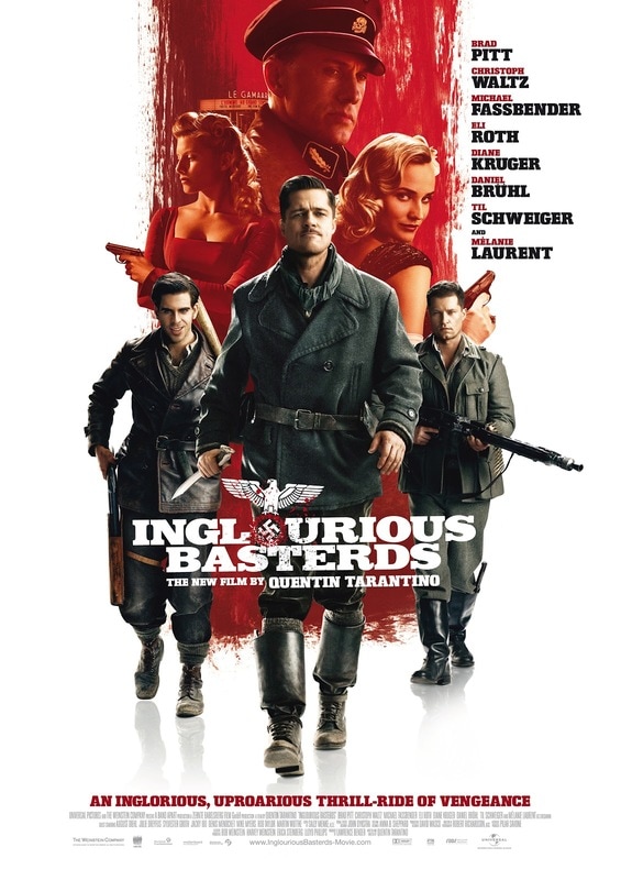
Our poster's layout has conformed to some conventions as previously mentioned. The title is located at the bottom of the poster which is a technique used by lots of posters as it creates room for the iconic image as the main focus for the viewer. Our poster also features small technical credits at the bottom which are present on every film poster as they are a legal requirement so technically our poster conforms to this convention. The text at the top of our poster is inspired by Quentin Tarantino's film posters as it is in a similar style and layout to how his posters present the stars of the film. We developed this with our poster as we also laid out the large amount of actors that are in the film along the top of our poster, matching the chosen colour scheme.
|
|
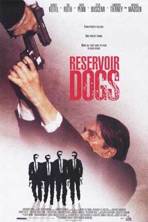
|
These are posters for some of Quentin Tarantino's films and as you can see, the actors names are usually grouped together and there are a lot of them. This was the inspiration for how we laid out the names of our actors on our poster.
Website
At the bottom of our poster, underneath the technical credits, we have displayed our website for the viewer to visit if they want to. This isn't uncommon for film posters to have but a lot of them still choose not to present a website that has more information about their film. We did not create this web domain (or even know if it already exists or not) but we thought we would add it for creative and aesthetic purposes.
